Link- http://i00.i.aliimg.com/img/pb/892/391/409/409391892_003.jpg
search it on google and use it fro my size sheet .
Thursday, 1 October 2015
Talk about the technique you have used .
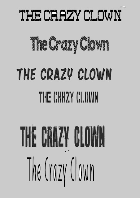
I have been using sceenshot. To get my logo from DAfont . I have then paste them into Photoshop and I chose my font for my advert .
I then clicked ctrl +t , so I can re size my fronts into a A4 sheet of paper, into Photoshop .I Then used a Rectangular marquee tool so I can select the area that I wanted to be used in my advert. I then paste my fonts it into a A4 sheet, and then added more of my favorites fronts into A4 sheet .Then I used magic erase to delete background of my fonts.
Why did you choose the font .
- Seven deadly sins
- Shibuya Zero
- Friday Night
- Nuevo Disco
- Liniga Font
- Red Zone
Why do they fit your theme ?
- This would fit into my advert because, it would go with the scary theme .Into the advert I am making.
- This would go with the clown because , It looks like a criminal font ,so the clown can become a criminal ,as he already his.
- This would go with the clown more then the other two fonts .
- The logo looks kind of immature.The clowns is kind of immature ,so it will go with the font a lot more ( theme of the shampoo advert)
- This goes with the 4th logo , but it kind of makes it creepy to go with the theme of how shampoo .
- The logo looks like a crazy fonte, so I can put it on how advert and t make it bonuce out to the audiences.
Week 3 Tutorial
Liberty tour
We went on a tour into the Library I through it was boring because, I've already been in the liberty last year .
I have learn some new things about the liberty from last year .I Like how they have different books, and software they got on their computers (photoshop, and other softwares) .
I like this book because , it has manga in it ,as character looks like a anime character I have seen before .Hopefully I would buy from library .
Tuesday, 29 September 2015
sound effcet idea :
https://www.youtube.com/watch?v=1P526n6wfP4 ( evil laught )
https://www.youtube.com/watch?v=p9XMd2eAy_4 ( theme song )
https://www.youtube.com/watch?v=1P526n6wfP4 ( evil laught )
https://www.youtube.com/watch?v=p9XMd2eAy_4 ( theme song )
week 3 29/09/2015
I am working in a group of 4 and my team mates are :
Rosie
Dan
(me) Beth
Victoria
skills :
My:
drawing
Photoshop
writing
Rosie:
Acting
dan:
Computer
instruments
Objects:
Instruments
Baseball
---------------------------------------------------------------------------------------------------------------------
Freaky advert :
ad 1 : Ice cream advert (Little baby's)
Link-https://www.youtube.com/watch?v=erh2ngRZxs0
my rating : 10/10
Digest:
ad 2 : Gold band liqua shaq ( by the way that the name and not any spelling mistake .)
Link: https://www.youtube.com/watch?v=1tF2dF67Q2c
The face was hape-shifting ,and I found it really funny ,but it freaked me out a lot .The face movement look like it was created on Photoshop.If we after to recreate this advert we would use a step by step sceenshots, to recreate it into Photoshop, on the face movements .
Digest or Non digest :-The man was talking really seriously, but the mans face kept on moving ,so it is distracted you from the voice .The background music sound like one those cheese america advert .
My rating : 8/10
ad 3 : The judderman
Link :- https://www.youtube.com/watch?v=b2IxIBtMvi0
I am working in a group of 4 and my team mates are :
Rosie
Dan
(me) Beth
Victoria
skills :
My:
drawing
Photoshop
writing
Rosie:
Acting
dan:
Computer
instruments
Objects:
Instruments
Baseball
---------------------------------------------------------------------------------------------------------------------
Freaky advert :
ad 1 : Ice cream advert (Little baby's)
Link-https://www.youtube.com/watch?v=erh2ngRZxs0
The guy in the video was eating ice cream of his own head and I found it disturbing .It is like he he got hair in the ice cream,while he was eating .It made me feel really sick whiles watching the man eating of his own head .
Non -Digetic sound : It was like the mans was talking from his conscience, and made it really disturbing, in the advert .The eyes look like they were go to pop out of his own skull .The movement was still kind of still , but the man was moving only in the advert.
my rating : 10/10
Digest:
ad 2 : Gold band liqua shaq ( by the way that the name and not any spelling mistake .)
Link: https://www.youtube.com/watch?v=1tF2dF67Q2c
The face was hape-shifting ,and I found it really funny ,but it freaked me out a lot .The face movement look like it was created on Photoshop.If we after to recreate this advert we would use a step by step sceenshots, to recreate it into Photoshop, on the face movements .
Digest or Non digest :-The man was talking really seriously, but the mans face kept on moving ,so it is distracted you from the voice .The background music sound like one those cheese america advert .
My rating : 8/10
ad 3 : The judderman
Link :- https://www.youtube.com/watch?v=b2IxIBtMvi0
The advert reminded me of a surrealism film, that I did researching about last year., it is by Salvador dal who a famous artist
.I liked the puppets in the advert ,because the puppet turned into a man .I liked the black and white affect in the advert , What makes this creeper on the advert . The digetic sounded in the advert , was like it added a horror movie theme song , for the background sound .The advert was to make it more of a creepy advert ,
My rating : 9/10
Monday, 28 September 2015
week 3 28/9/2015
I have been playing arounded in Photoshop again . I have been using levels in Photoshop, to make the image more dark or more of light image , as the Redhead can make the objects too bright sometime ( It is what objects you are using). I have then used curves to change the effect of my object ,as you can see on my work .I then clicked the eyedropped tool (curves version) to change color of my object . I also add the clone to make it 3D ( did it out of random)
I have been playing arounded in Photoshop again . I have been using levels in Photoshop, to make the image more dark or more of light image , as the Redhead can make the objects too bright sometime ( It is what objects you are using). I have then used curves to change the effect of my object ,as you can see on my work .I then clicked the eyedropped tool (curves version) to change color of my object . I also add the clone to make it 3D ( did it out of random)
Friday, 25 September 2015
Image 1 :
Link –http://becuo.com/really-scary-zombies
really-scary-zombies
By- unknown
I like this because of the make-up effect. It stands out a lot .this is very creepy to me and thats why I like it so much .
This is made with make –up ,glue and cotton wool .
By- Unknown
I like this because it is really cute and adorable. The camera his focused on to the kid, and the background is blurred out.
This is created with a camera , with some fashion media . The hair was created with hair gel.


Link –http://becuo.com/really-scary-zombies
really-scary-zombies
By- unknown
I like this because of the make-up effect. It stands out a lot .this is very creepy to me and thats why I like it so much .
This is made with make –up ,glue and cotton wool .
Image 2 :
Link –http://www.taringa.net/posts/tv-peliculas-series/18822192/Miren-es-Pan-la-nieta-de-Goku.htmlBy- Unknown
I like this because it is really cute and adorable. The camera his focused on to the kid, and the background is blurred out.
This is created with a camera , with some fashion media . The hair was created with hair gel.
Image 3 :
Link –http://www.dazzlingwallpaper.com/post_fullview_new.php?id=716
By-Unknown This inspired me a lot, it’s a really nice piece of art, and has very colourful effect. The background is blended together .This makes me feel really happy as the boat/ship is really glowing .
I think it is mixed media ,And that is Photoshop and oil paint .What as combine it together .
Image 4 :
Link –http://www.anti-glamour.ru/syurrealizm-marianny-stelmax-marianna-stelmach-25-kartinok/
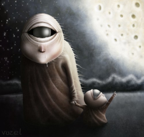
By-Vuzel
I like this because of the light and shadow binds together into the background. The Image brings emotion ,as it look like the mother and child are moving on .This make me sad ,as the tears show some emotion. This was created with pastel ,because of the moon effect. The detail looks like it was created with pastel .
Image 5 :
Link –http://www.whatthehellnews.com/
By- Unknown
This inspired me because it has two different meanings of the image, as one shows a face and the other show you photographic side of the image. This make me feel mixed emotions, as it has got no emotion towards the image, but I like it a lot. This was created with photography.
Image 6 :
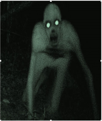
Link ttp://newmediarockstars.com/2015/02/youtube-for-kids-allows-creepypasta-other-scary-videos/
By-Jeff Klima
I like this Because
of the glow eyes and Looks like a zombie .
It made with photography and some make up.
Image 7 :
By-Thomas Barbey
I like this because of combined images together and the black and white colour is really effective to the image.
Image 8 :
Link : http://demilked.uuuploads.com/surreal-photography-kevin-corrado/surreal-photography-kevin-corrado-3.jpg
Link : http://demilked.uuuploads.com/surreal-photography-kevin-corrado/surreal-photography-kevin-corrado-3.jpg
by-kevin-corrado
I like this because , it reminded me of a horror movie and it is kind of spooky , as the man has got no body and you only see the arms and legs of the body .I like the black &white colour ,as it brings out the image alot and looks like the 1930s America .
I like this because , it reminded me of a horror movie and it is kind of spooky , as the man has got no body and you only see the arms and legs of the body .I like the black &white colour ,as it brings out the image alot and looks like the 1930s America .
This was used with a camera & photoshop to recreate this image into a surreal art .
If i recreated that ,I would mix the arms & legs around to make more creepy image and to have some blood stain to make the image stand out more .
Image 9 :
by-phil
I like this because , it looks like the leopards are going to jump out on you after the photo is taken.The background is blurry , behind the leopard ,and it looks like two pictures were taken and meraged together into one image.
This was taken with a camera .
If I had recreate this I would use a kitten , because I cannot bring a real life leopard into class ,as the leopard will kill us and eat us alive.
Image 10 :
Link :http://royreid.ca/2013/10/04/beautiful-animal-photography/
by : phil
by : phil
I like this because of the forces of the deer and the background is cut out from the deer . It kind of reminds me of Bambi a bit . It makes me drawn into the deers eye and makes me think of the deers life instead of my own life.
It is taken with a camera .
If I had to recreate this , I would go up to wollton park to take a deer photo and edit it on photoshop to make it really effective.
Subscribe to:
Posts (Atom)


