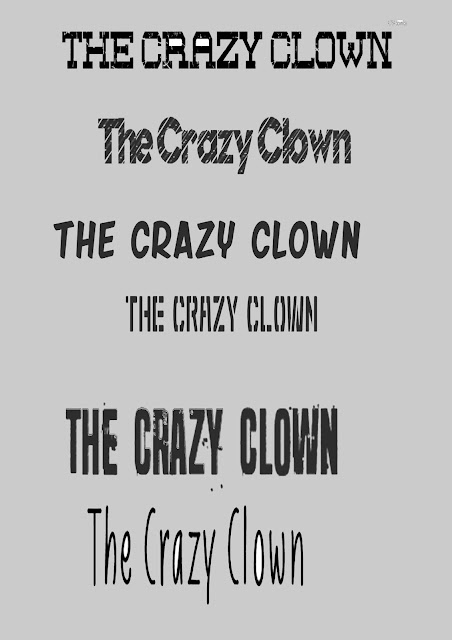
Talk about the technique you have used .
I have been using sceenshot. To get my logo from DAfont . I have then paste them into Photoshop and I chose my font for my advert .
I then clicked ctrl +t , so I can re size my fronts into a A4 sheet of paper, into Photoshop .I Then used a Rectangular marquee tool so I can select the area that I wanted to be used in my advert. I then paste my fonts it into a A4 sheet, and then added more of my favorites fronts into A4 sheet .Then I used magic erase to delete background of my fonts.
Why did you choose the font .
- Seven deadly sins
- Shibuya Zero
- Friday Night
- Nuevo Disco
- Liniga Font
- Red Zone
Why do they fit your theme ?
- This would fit into my advert because, it would go with the scary theme .Into the advert I am making.
- This would go with the clown because , It looks like a criminal font ,so the clown can become a criminal ,as he already his.
- This would go with the clown more then the other two fonts .
- The logo looks kind of immature.The clowns is kind of immature ,so it will go with the font a lot more ( theme of the shampoo advert)
- This goes with the 4th logo , but it kind of makes it creepy to go with the theme of how shampoo .
- The logo looks like a crazy fonte, so I can put it on how advert and t make it bonuce out to the audiences.

No comments:
Post a Comment